CONCEPT PROJECT · 2026
Marque
A luxury car marketplace where buying and renting feel equally trustworthy.
OVERVIEW
Marque is a concept app for buying, financing and renting luxury cars in Lagos. I designed it end to end, from a drive-in splash to the privacy policy at the bottom of the profile.
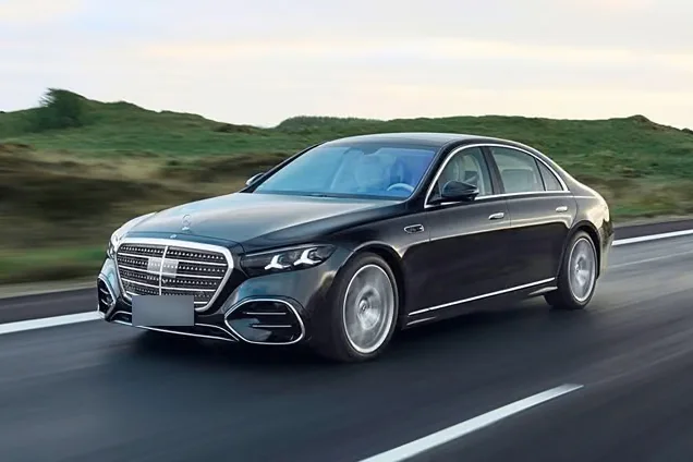
The result is 35 screens in 11 sections, built around photographs of six real cars: a Buy journey with offers and finance, a Rent journey with an itemised price, and the account system behind both.
ASSUMPTIONS
Three things I assumed, and what each one changed.
-
01 · ASSUMPTION
Buyers decide on paperwork, not horsepower.
SO THE APP
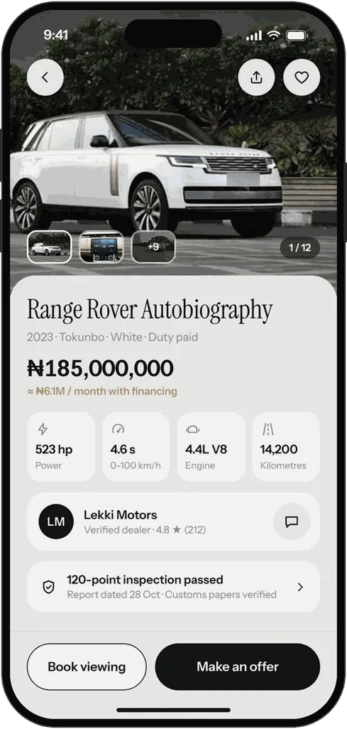
Puts duty status, customs verification and the inspection date directly under the price.
-
02 · ASSUMPTION
A rental price feels like a trap when the fees arrive late.
SO THE APP
Asks for dates first, then shows every line of the price and the deposit before the Pay button.
-
03 · ASSUMPTION
Buying and renting are one audience looking at the same cars.
SO THE APP
Has one home screen with a switch, not two separate apps.
DECISION 01
One switch, two modes.
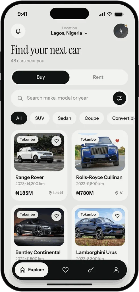
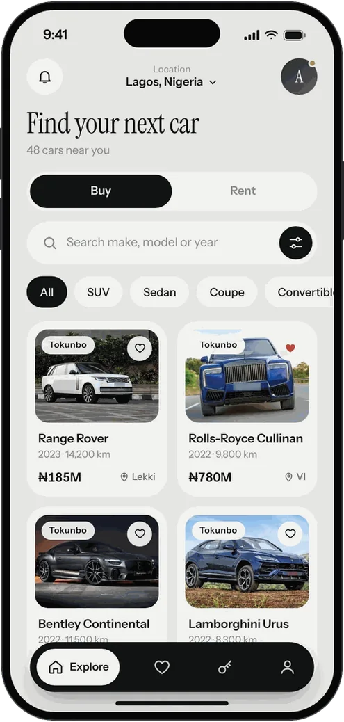
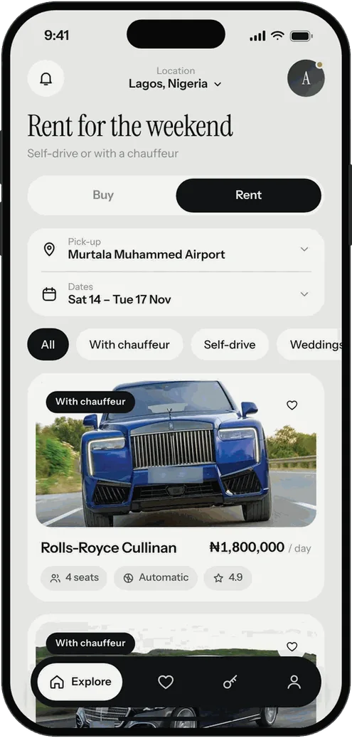
Buy and Rent share one home screen. The switch at the top changes what each card leads with: price and location when buying, a per-day rate and a chauffeur tag when renting.
The Rent view also opens with the pick-up point and dates, because those are what change the price.
DECISION 02
Trust sits next to the price.
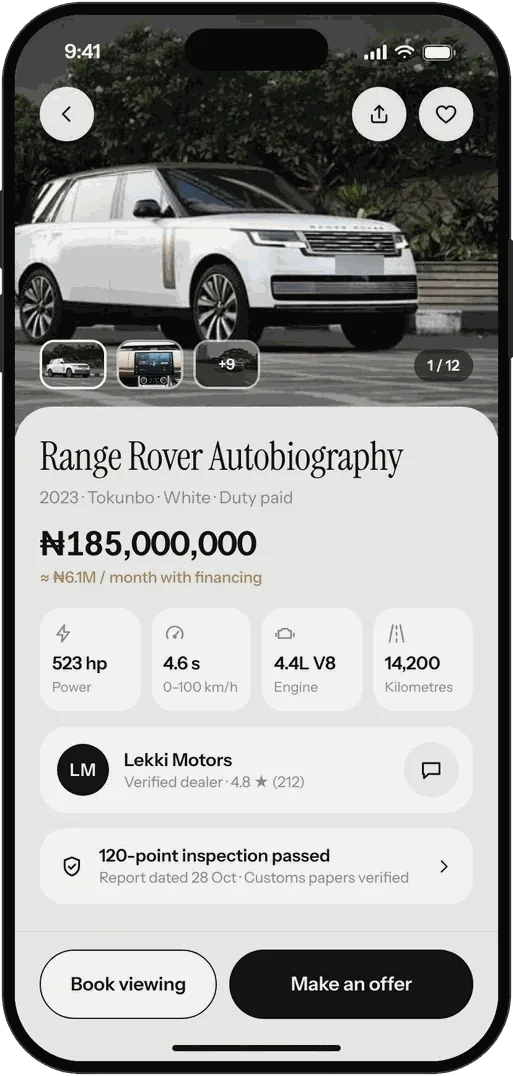
On a car page, the price is followed straight away by the three things a buyer worries about: duty status in the line under the name, the dealer with a verified badge and rating, and a one-line inspection result with the report date.
The thumb zone holds two actions only, Book viewing and Make an offer.
DECISION 03
An offer, not a buy-now button.
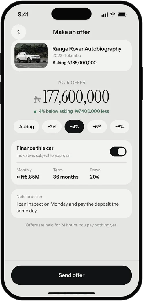
I assumed negotiation is the normal way to buy a car at this price, so the main action is Make an offer. It starts at the asking price with quick steps down to −8%, an optional finance toggle that shows an indicative monthly figure, and a note to the dealer.
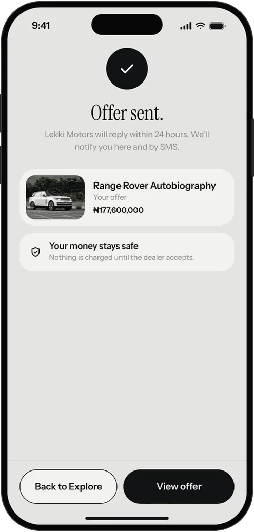
The screen ends with the reassurance a nervous buyer needs: offers are held for 24 hours, and nothing is charged yet.
DECISION 04
Every naira, before you pay.
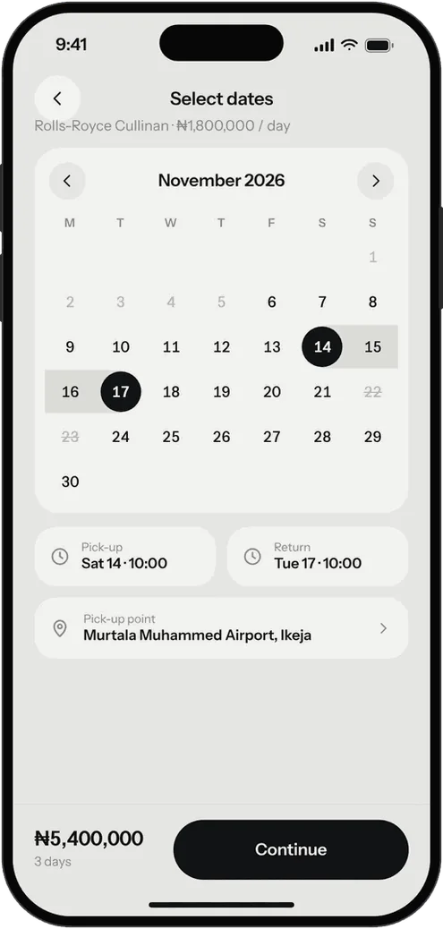
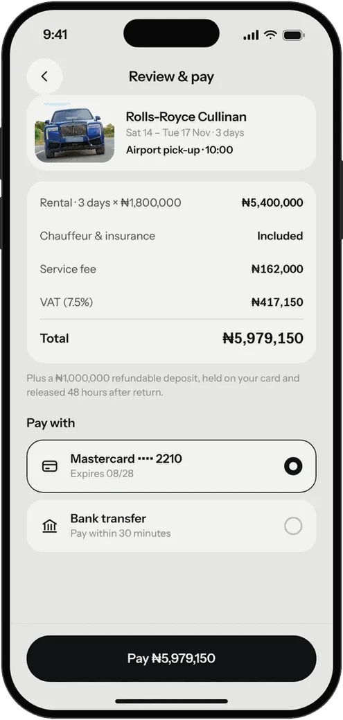
Renting goes dates first, then one itemised screen: rental, chauffeur and insurance, service fee and VAT, then the total.
The ₦1,000,000 refundable deposit is stated above the Pay button, with when it is released. After paying, the confirmation carries a booking code for the chauffeur.
DECISION 05
Soft grey, so the cars bring the colour.
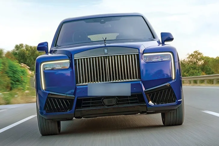
The interface is deliberately quiet: soft greys, near-black ink and one brass accent. Nearly all the colour on screen comes from the photographs, so a blue Cullinan or a white Range Rover is the loudest thing on the page. Instrument Serif gives headlines an editorial voice; Instrument Sans does everything you tap.
- Screen #E6E6E3
- Card #F2F2F0
- Ink #121314
- Brass #A88650
- Positive #3E7C5A
DECISION 06
A splash that sells the car.
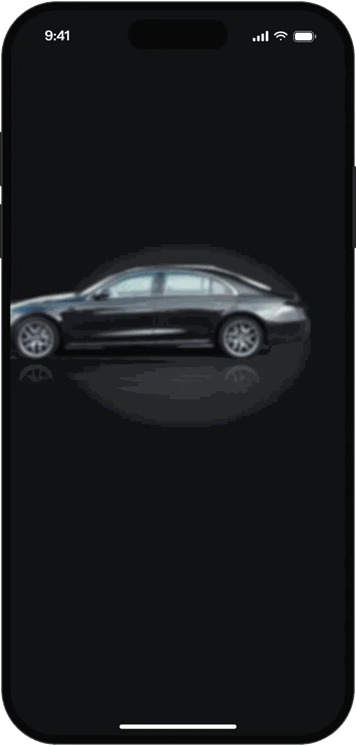
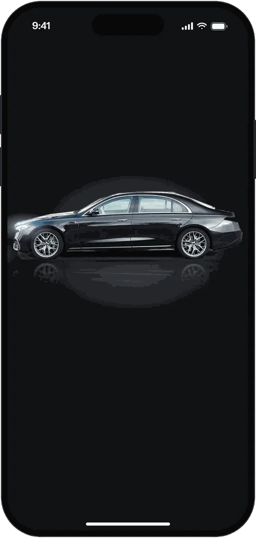
The opening should feel like the product. A car drives in, brakes and settles, the headlights come on, then the wordmark and the welcome copy rise in. I drew it as six frames with identical layers so Figma’s Smart Animate can tween between them, and built the same sequence as a standalone animated prototype.
-
1 Car enters -
2 Braking -
3 Settling -
4 Headlights on -
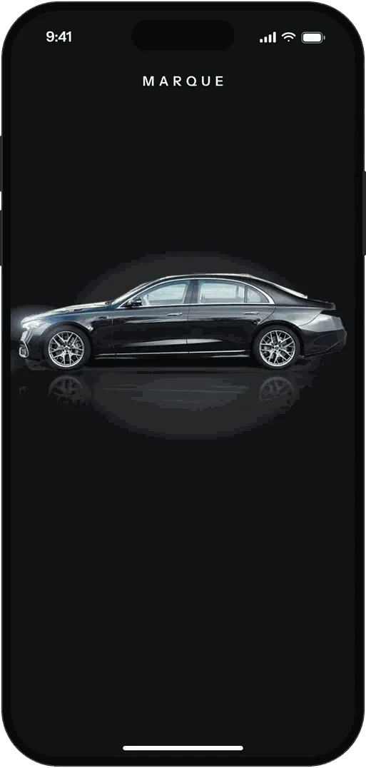
5 Wordmark -
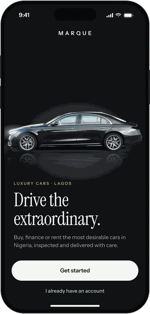
6 Welcome
THE REST OF THE APP
A marketplace that stops at the car page isn’t a product.
So I designed what sits around it: sign-up with phone verification, a guest mode, search with recent and popular makes, notifications, saved cars and trips, a profile with payment methods, phone, email, licence and selfie verification, a help centre, and the privacy policy and terms. Two sheets handle booking a viewing and logging out.
-
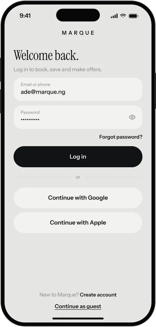
Log in -
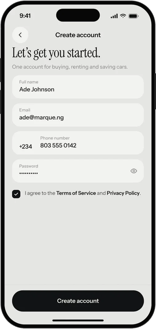
Create account -
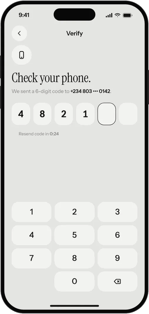
Verify phone -
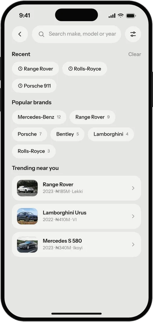
Search -
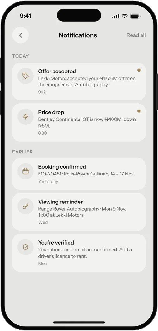
Notifications -
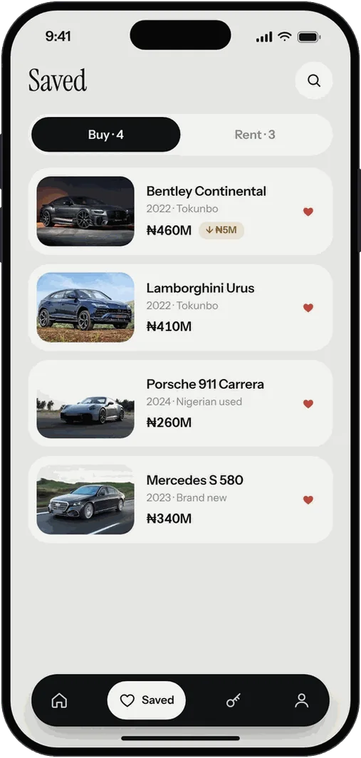
Saved -
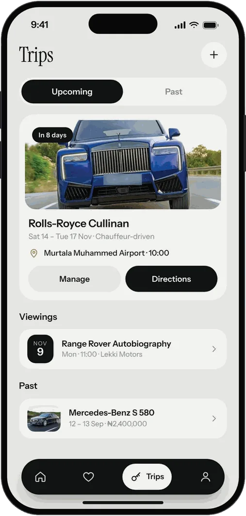
Trips -
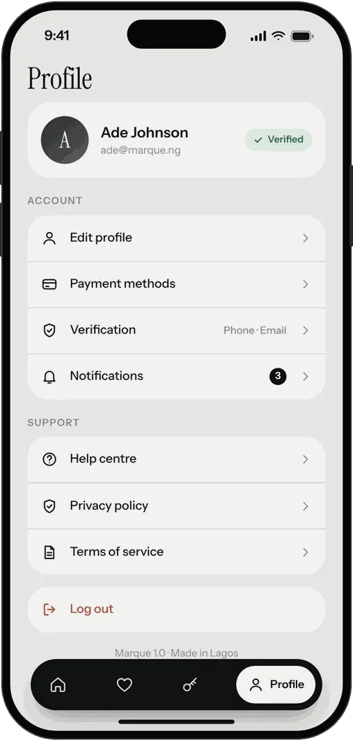
Profile -
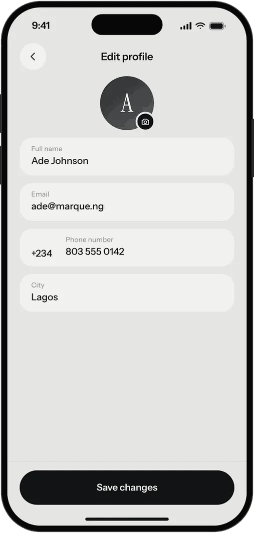
Edit profile -
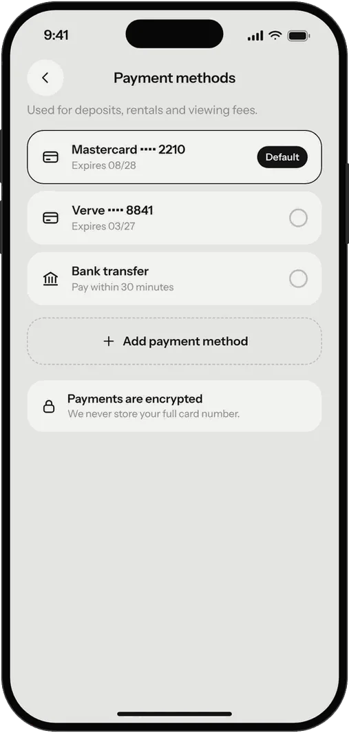
Payment methods -
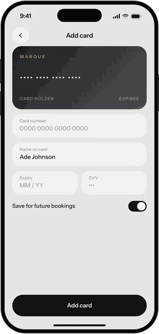
Add card -
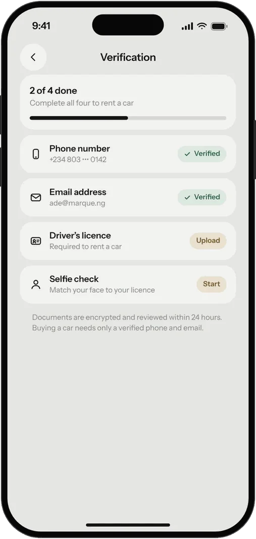
Verification -
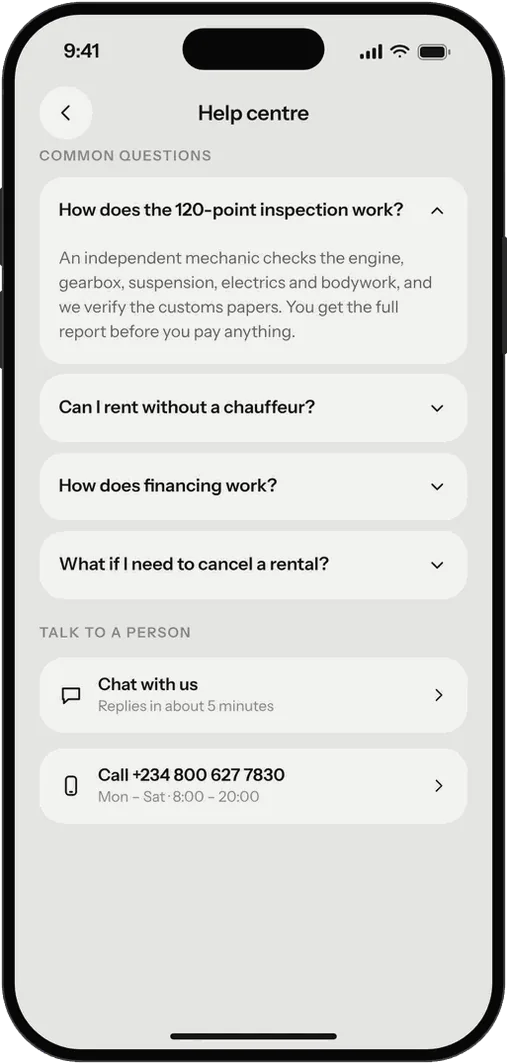
Help centre -
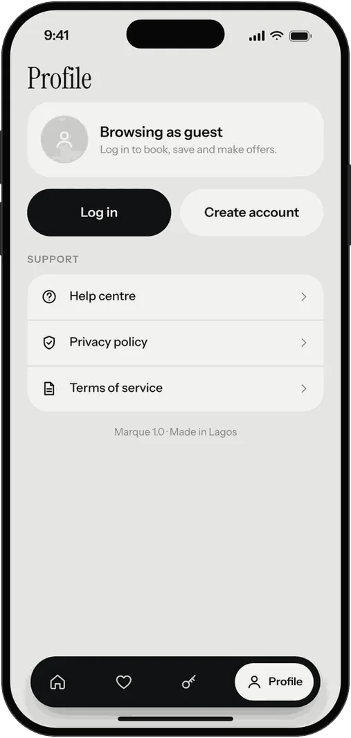
Guest profile -
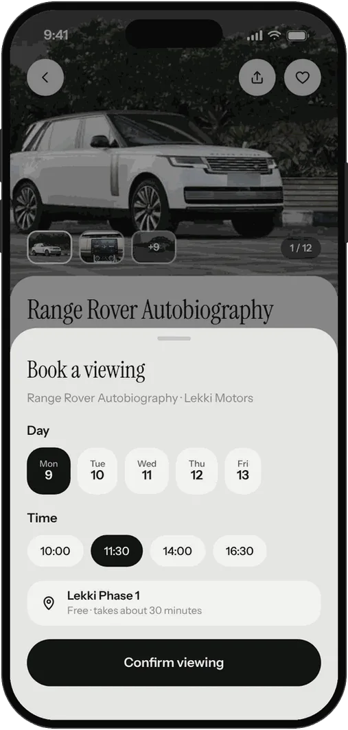
Book a viewing -
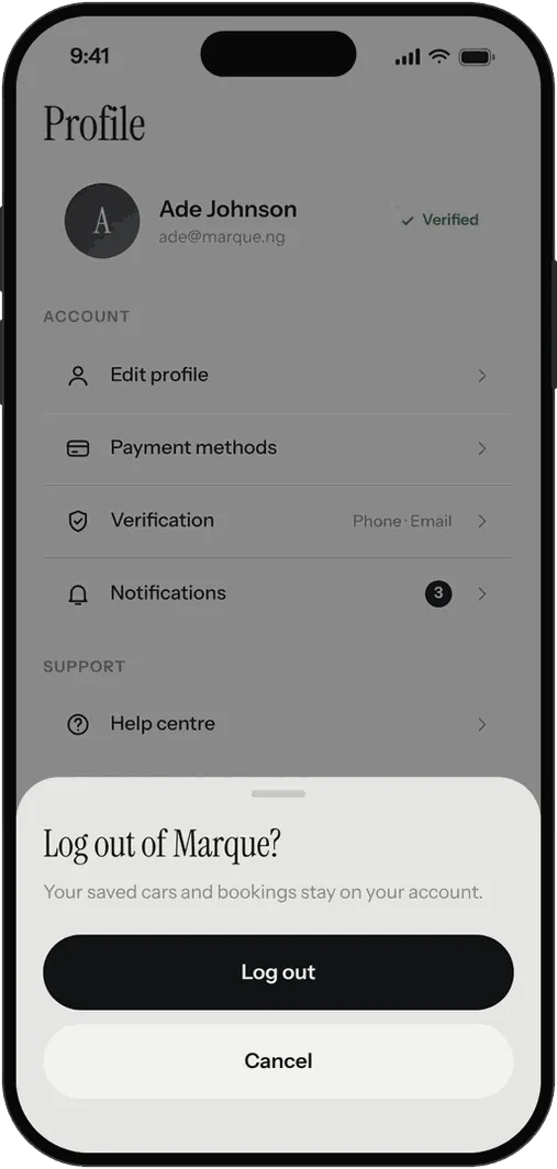
Log out
HOW I BUILT IT
Map it, build it in code, then make every control work.
-
01
Mapped before drawn
I listed every screen and every tap target first, in 11 sections, so nothing in the prototype leads nowhere.
-
02
Built in code
The screens are HTML and CSS sharing one set of components and the real photographs, which kept 35 screens consistent and made a change to one place a change to all.
-
03
Made clickable
A prototype where every control routes somewhere, from splash to log out, checked with 67 automated route tests. I also wrote a Figma plugin that rebuilds the screens as editable layers with components and prototype links.
WHAT I’D TEST NEXT
Three questions the prototype can’t answer.
-
01
Do buyers trust the inspection line?
Test the car page with and without it, and watch where people look before they tap Make an offer.
-
02
Do renters read the breakdown?
See whether people study the itemised screen or jump to the total, and whether stating the deposit up front causes drop-off.
-
03
Is one switch enough?
Give people a goal, such as “rent something for the weekend”, and see whether they find Rent on the first try.
I would run these with five to eight buyers and renters in Lagos before changing anything.
NEXT
See the product page.
Marque landing pageNotes on the work
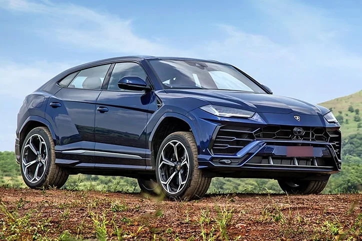
Cars, dealers, prices, ratings and bookings are sample data. The car photographs are used for concept purposes, and the colour options on the Cullinan and Urus are recoloured previews, not photographs of those paint options. The design has not been tested with users.
ademolaadeagbo.com.ng